User guide
pip install reglscatterpy            # core: numpy, pandas, anywidget
pip install anndata                  # for AnnData (mudata / spatialdata as needed)
Or from bioconda:
Quick start
Give it an AnnData, say which embedding to show (basis=) and what to color by,
which can be an obs column or a gene name:
import scanpy as sc
import reglscatterpy as rs

adata = sc.datasets.pbmc3k_processed()
rs.scatterplot(adata, basis="umap", color_by="louvain")   # color by cell type
rs.scatterplot(adata, basis="umap", color_by="CST3")      # or by a gene
For a plain DataFrame, give the coordinate columns with x= / y=:
import numpy as np, pandas as pd
df = pd.DataFrame({"x": np.random.rand(10_000), "y": np.random.rand(10_000),
                   "ct": np.random.choice(list("ABC"), 10_000)})
rs.scatterplot(df, x="x", y="y", color_by="ct")
Plots are live and kernel-linked by default, so the selection returns to Python straight away. Keep a handle to lasso and read it back:
w = rs.scatterplot(adata, basis="umap", color_by="louvain")   # interactive by default
w                          # show it, then lasso a population in the browser
w.selection                # the cells you circled, back in Python
For a portable figure to keep or share, pass interactive=False (see
Interactive by default).
What you can do
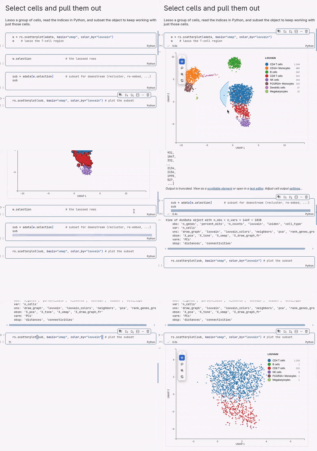
Lasso a population and pull it out
Circle cells in the plot, read them back as indices, and subset the AnnData for anything downstream (recluster, re-embed, save).
w.selection                # -> [12, 87, 134, ...] positional indices
sub = adata[w.selection]   # a normal AnnData subset
Label clusters by hand
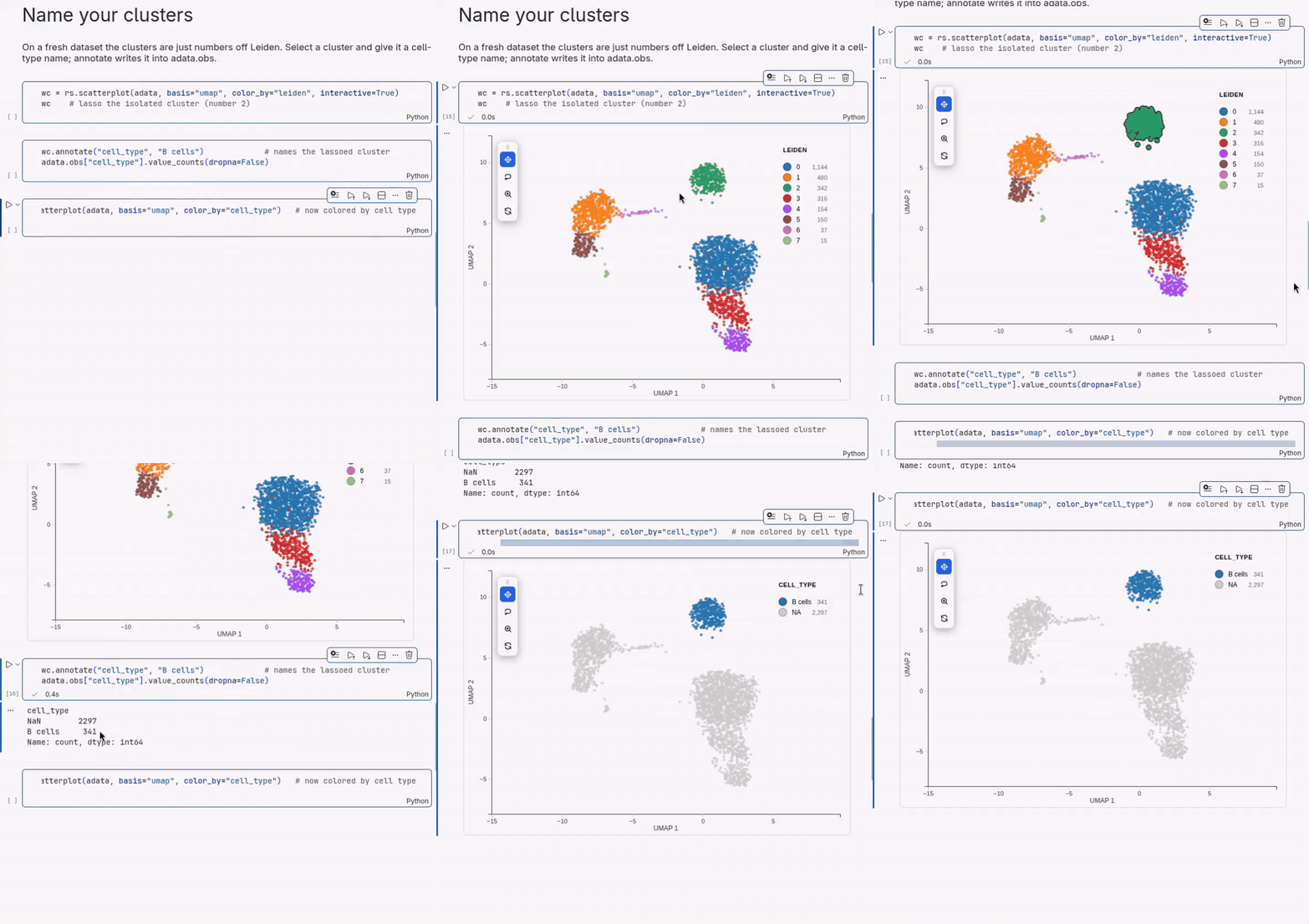
Select a cluster, give it a name, and the label is written into adata.obs. Do
it a few times and re-plot by your new column.
w.annotate("cell_type", "B cells")            # writes adata.obs["cell_type"]
rs.scatterplot(adata, basis="umap", color_by="cell_type")
Markers of a selection
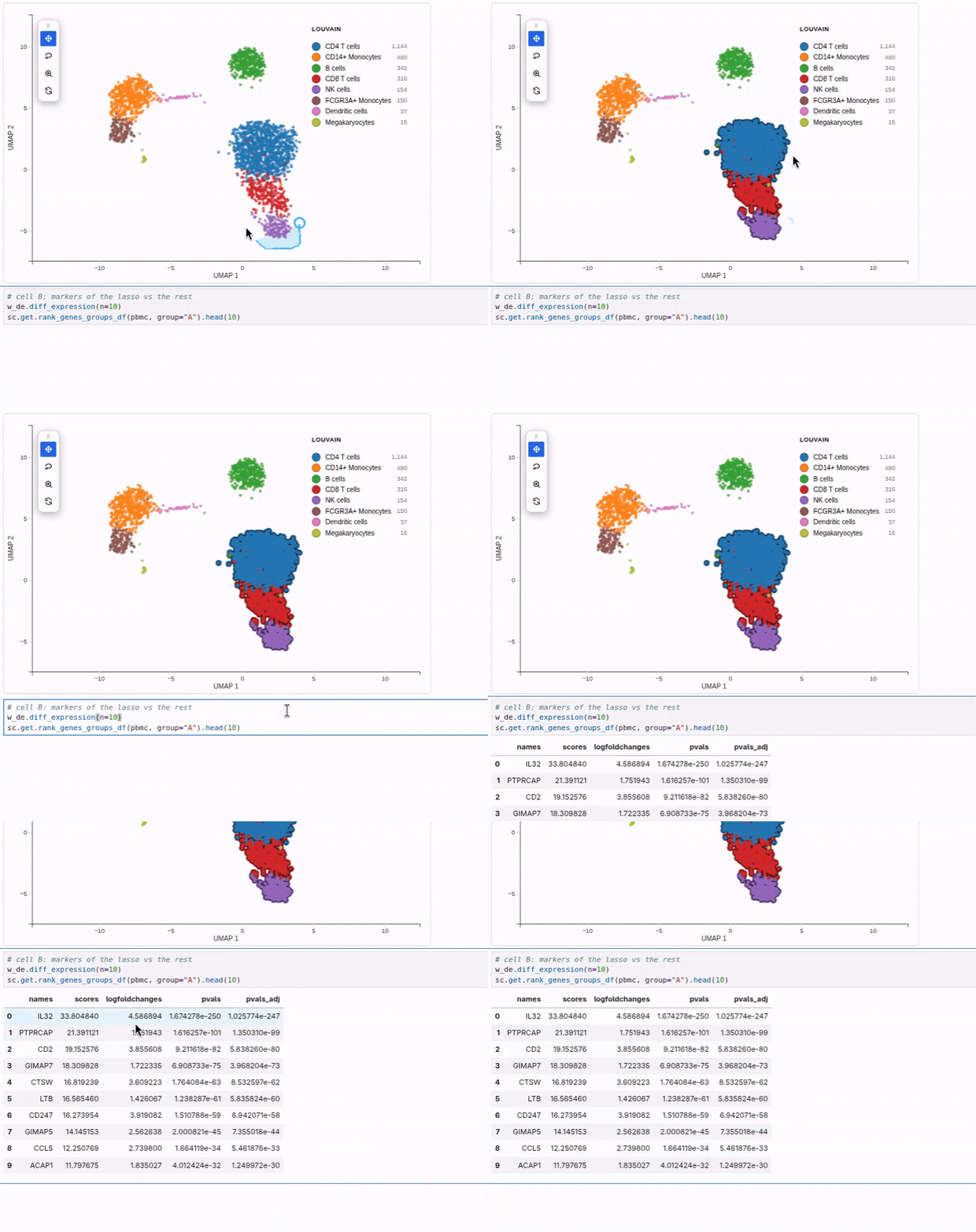
Lasso a population and call diff_expression. It returns scanpy's native result
and saves it to adata.uns, so the rest of scanpy just works. Results are
identical to a direct sc.tl.rank_genes_groups call.
w.diff_expression(n=10)                         # selection vs the rest
sc.get.rank_genes_groups_df(adata, group="A")   # tidy table
sc.pl.rank_genes_groups(adata)                  # scanpy's own plot, right after
Summarize markers with a dot plot
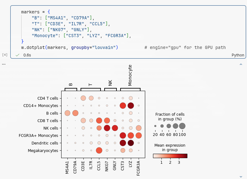
w.dotplot gives the scanpy dot plot (fraction of cells expressing as dot size,
mean expression as color) from the same object you are plotting. Pass a plain
gene list or a labelled marker dict.
markers = {"B": ["MS4A1", "CD79A"], "T": ["CD3E", "IL7R", "CCL5"],
           "NK": ["NKG7", "GNLY"], "Monocyte": ["CST3", "LYZ", "FCGR3A"]}
w.dotplot(markers, groupby="louvain")           # engine="gpu" aggregates on the GPU
Compare many panels, filter across all of them
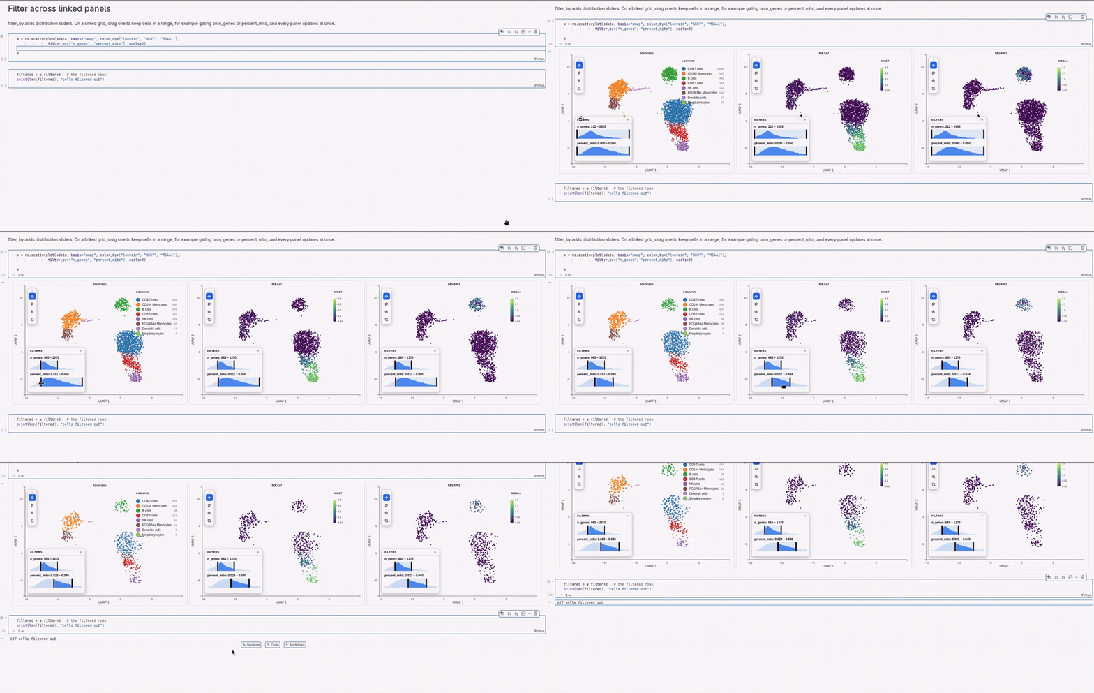
Color one embedding by several genes or columns at once and you get a linked
grid, one panel per value, with camera and lasso kept in sync. Add filter_by
to gate on a value (for example n_genes or percent_mito) and every panel
updates together.
rs.scatterplot(adata, basis="umap",
               color_by=["louvain", "NKG7", "MS4A1"],
               filter_by=["n_genes", "percent_mito"], ncols=3)
Land a set of cells you already have
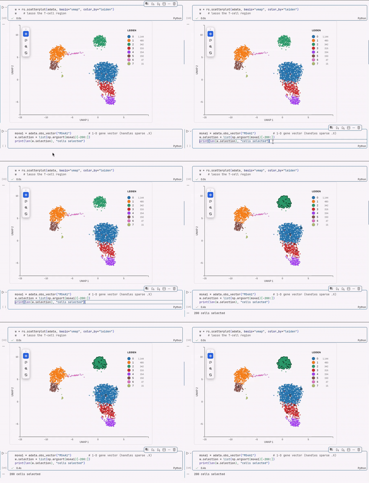
You do not have to lasso. Set the selection from any list of indices or names, for example a gene signature or a set of cells from another tool, to see where they sit. Here, the 200 cells with the highest MS4A1 land on the B-cell cluster.
ms4a1 = adata.obs_vector("MS4A1")               # 1-D gene vector, sparse-safe
w.selection = list(np.argsort(ms4a1)[-200:])
Move between a UMAP and the tissue
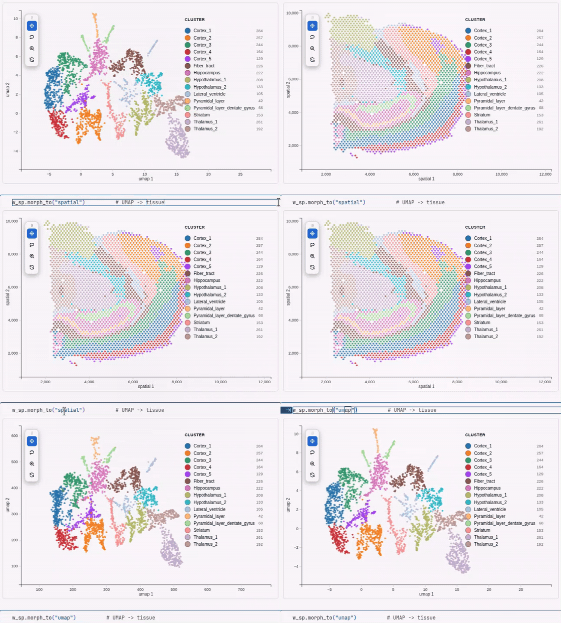
For spatial data both layouts live in the same object, so cells can glide from a UMAP into their tissue coordinates and back, carrying color and selection.
w = rs.scatterplot(adata, basis="umap", color_by="leiden", interactive=True)
w.morph_to("spatial")              # animate UMAP into tissue coordinates
w.morph_to("umap", duration=800)   # and back (ms)
More on selections and analysis
The selection is a normal round-trip: read it, or set it from Python.
w.selection                      # positional indices
sub = w.subset()                 # same as adata[w.selection]
w.selection = list(range(100))   # drive it from Python to highlight points
Differential expression, in a bit more detail. diff_expression compares a
group against the rest or against a second group; diff_expression_by splits a
lasso by an obs column (for example condition or time) and compares its
levels. Both return scanpy's native result and auto-save to adata.uns.
a = w.selection                                # save group A
# lasso group B
w.diff_expression(a, w.selection)              # A vs B

res = w.diff_expression_by("condition")        # each level vs the rest
w.diff_expression_by("condition", group_a="D30", group_b="Y1")   # one pair
By default DE uses scanpy when installed and warns if it has to fall back. Pass
engine="scanpy" to require it, or run on the GPU with engine="gpu" (needs
cupy, about 19x faster on 120k cells), or engine="rapids" for GPU logreg via
rapids-singlecell. The same
engine= option accelerates dotplot aggregation. See the
widget API for the
full table.
See what a region is made of:
Scales to millions of cells
By default scatterplot() keeps large datasets interactive without silently
hiding cells:
# AUTO (default): caps at 500k with a density-preserving subsample that KEEPS
# rare cell types. The plot stays honest: an on-figure "500,000 of 3,900,000
# shown" caption, and w.selection still indexes ALL rows.
rs.scatterplot(adata, basis="umap", color_by="cell_type")

# ALL POINTS RESIDENT: every cell on the GPU, smooth up to ~4M on a decent card.
rs.scatterplot(adata, basis="umap", color_by="cell_type", max_points=None)
For datasets beyond roughly 4M cells, progressive=True renders a light density
overview and re-draws all cells inside the viewport as you zoom in, with no
preprocessing and the lasso staying complete:
Rule of thumb: max_points=None for 2 to 4M real atlases, progressive=True
beyond that.
Spatial data
Anything with coordinates in obsm["spatial"] plots the same way, so Visium,
Xenium, MERFISH and CosMx all work. Point basis at it:
import squidpy as sq
adata = sq.datasets.visium_hne_adata()         # public mouse-brain Visium
rs.scatterplot(adata, basis="spatial", color_by="cluster")    # tissue map
rs.scatterplot(adata, basis="spatial", color_by="Olfm1")      # a gene, in situ
rs.scatterplot(adata, basis="spatial", color_by="leiden", point_size=3)  # sparse tissue
Interactive by default, static snapshots on request
Plots are live and kernel-linked by default, so w.selection and the other
round-trips work with no extra flag. The trade-off is that a live widget needs a
running kernel and, like any Jupyter widget, may render blank when you reopen the
notebook later.
For a figure you want to keep or share, pass interactive=False. It renders a
self-contained snapshot (a sandboxed iframe with the WebGL bundle and data baked
in) that shows in JupyterLab, Notebook 7, VS Code and Colab and survives
reopening the notebook with no kernel, like a plotly figure. It stays
interactive to look at (pan, zoom, lasso, legend, tooltips, image export) but
cannot send a selection back to Python.
Use the default while you are actively selecting, and interactive=False for
the plots you want to embed in a shared notebook or report.
Save a standalone HTML
The Python equivalent of R's htmlwidgets::saveWidget: one self-contained
.html that inlines the widget and the plot data, so it opens in any browser
with no kernel and no internet.
The bundle is inlined gzip-compressed (about 0.5 MB), so a one-plot file is well
under 1 MB. To turn a whole notebook into one HTML report without re-running it,
call rs.record_html() once near the top, run the notebook, then
jupyter nbconvert --to html analysis.ipynb (needs nbconvert and ipykernel,
pip install 'reglscatterpy[report]').
Theme
Plots are a white figure card by default. Pass theme= to follow your notebook:
rs.scatterplot(adata, basis="umap", color="leiden", theme="auto")   # dark in a dark theme
rs.scatterplot(adata, basis="umap", color="leiden", theme="dark")   # always dark
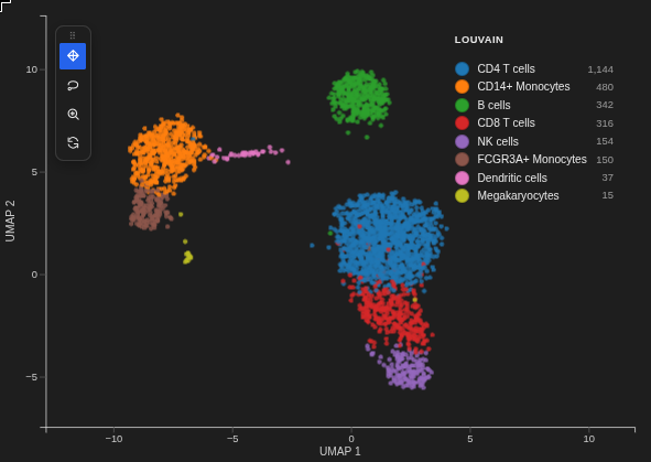
Set it once per session with rs.set_theme("auto"). The theme affects only the
live widget; an exported .html stays portably light.
Other options
- Richer tooltips:
tooltip_by=["n_genes", "sample", "CST3"]shows extra obs columns or genes on hover. - Outlines and highlighting:
add_outline=Truerings every point;w.highlight([12, 87, 134], color="red")marks a chosen subset that survives new lassoes. - Encode more variables:
size_by=andopacity_by=accept a numeric column or a gene. - Toolbar and legend:
toolbar="left"shows an in-plot toolbar;zoom_on_selection=Trueauto-frames a lasso; the categorical legend shows a live per-category count.
Supported objects
| Input | x (embedding) |
color_by / group_by |
|---|---|---|
AnnData |
obsm key ("X_umap", "umap", "spatial") |
obs column or var_names feature |
MuData |
global obsm or "modality:embedding" |
obs column or "modality:feature" |
SpatialData |
table's obsm (defaults to "spatial") |
table's obs or features |
pandas.DataFrame |
column name | column name or vector |
numpy.ndarray |
column index | vector |
Same plot in R and Python
rs.scatterplot(...) mirrors R's reglScatterplot(...): color_by / group_by,
point_size, opacity, point_color, continuous_palette /
categorical_palette, custom_colors, vmin / vmax, filter_by, legend
styling, and more. Equivalence is locked down by tests/test_payload_parity.py,
which checks the Python payload byte-for-byte against R fixtures.
Develop and test
The widget itself (src/reglscatterpy/static/widget.js) is a built artifact; its
source lives in the reglScatterplotR repo under js/. To refresh it after a JS
change, build there and copy dist/widget.js into src/reglscatterpy/static/.